
Content & Marketing · UK Guide 2026
Before-and-After Project Photo Guide
Updated 9 September 2026 · 2,542 words
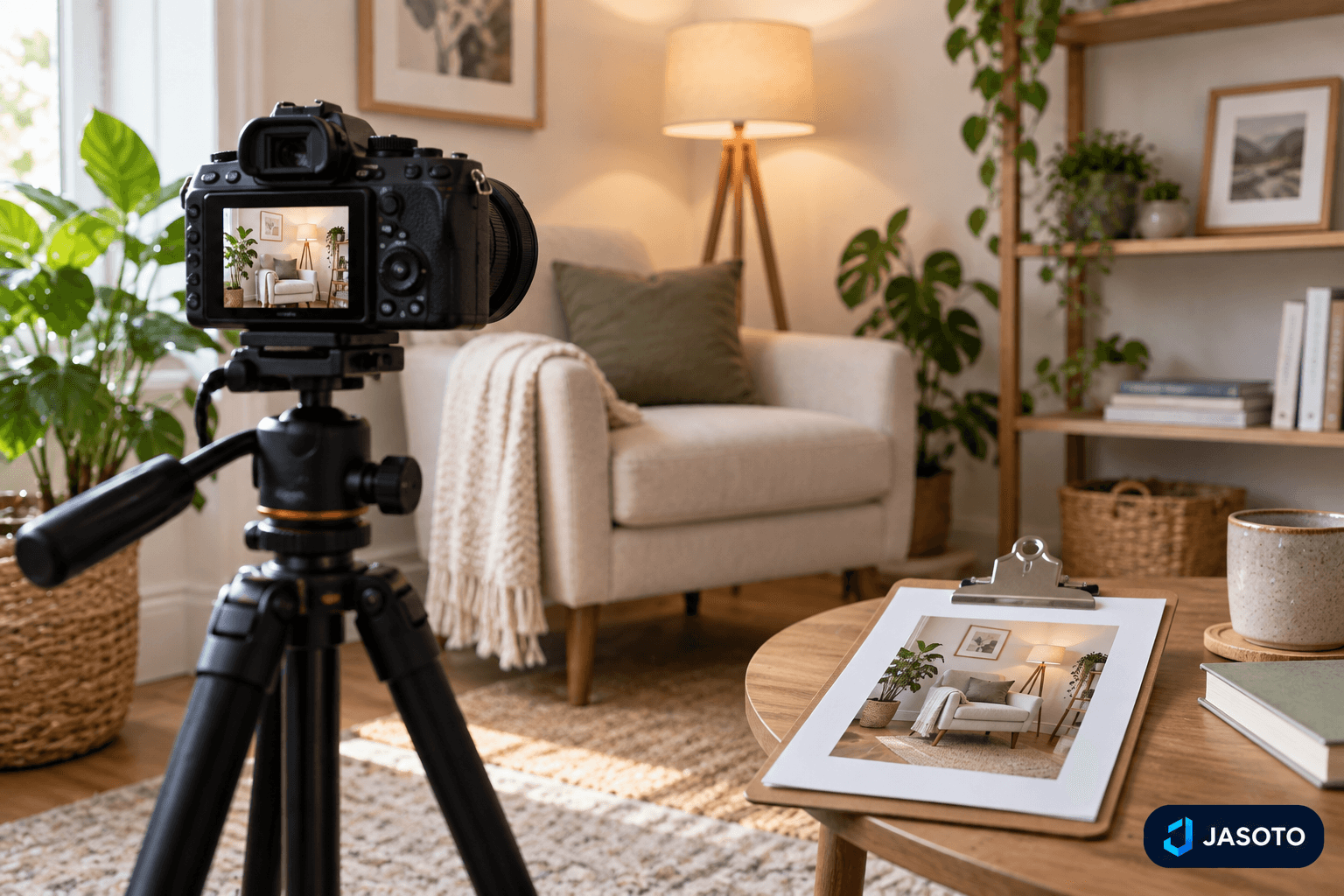
AI-generated illustrative image. It does not depict an actual customer project or a tested product.
Before-and-after project photos can do a lot of work for a business. They help a customer understand a service quickly, show the scope of a job and make it easier to explain the difference between a starting point and a finished result. That only works, though, if the comparison is fair. A misleading pair of images can make the work look better or different than it really was, while a careful pair can support the story you want to tell without overclaiming.
The strongest approach is simple: plan the first photograph before work begins, repeat the viewpoint afterwards and describe the change honestly. The image should help a customer judge the actual project, not a polished version of it. That means paying attention to permission, frame position, lighting, editing and captions, and keeping the original file so the record can be checked later. In other words, the photos need to be useful as well as attractive.
At a glance
- Before-and-after photos work best when the first shot is planned early and the after shot repeats a similar viewpoint.
- Comparable lighting, restrained editing and honest captions make the comparison easier to trust.
- Keep permission details, original files and privacy checks with the image record.
- A clear caption should explain the actual task, the completed work and any limits without overstating the result.
Start with permission and a clear purpose
Before you take any project photographs, make sure you know whether photography is allowed and how the images may be used. That matters both for practical reasons and for trust. A customer may be comfortable with a work-in-progress image for internal records but not for marketing, or they may agree to a public photo only if certain details are hidden. If the agreement is unclear, the image becomes harder to use later and easier to question.
It also helps to decide what the photo is meant to prove. Is it showing an improvement in appearance, a change in layout, a completed repair or simply the state of a room before work started? The answer affects the viewpoint, the caption and the amount of context you need to include. A picture that is useful for one purpose may be weak for another, so the goal should be specific from the start rather than added afterwards.
Choose a repeatable viewpoint before work begins
The fairest before-and-after comparison usually begins with a camera position that can be found again later. A similar height, angle and field of view make the change easier to understand because viewers are looking at the same area in both photographs. If the first picture is taken from one doorway and the second from a lower or wider angle, the change may appear bigger, smaller or simply different.
A practical method is to save a reference image or note the camera position once you have taken the before shot. Even a simple record can help if the after photograph is taken days or weeks later. This is especially useful on jobs where the finished area will look neat and uncluttered, because it may be harder to remember the exact frame once the work is complete. Repeating the viewpoint is not about making the images identical in every detail; it is about giving the customer a fair comparison of the same area.
Do not let the need for a neat picture interfere with safe working or access. If a symmetrical shot would mean standing somewhere awkward or moving equipment in a way that causes problems, choose a safer position and explain the angle in the caption if needed. A sensible comparison is always better than a forced one.
Make the lighting and timing as comparable as possible
Lighting can change the appearance of a project as much as the work itself. A bright afternoon after a dull morning can make colours seem cleaner or surfaces look more even, even when the actual work has not changed much. For that reason, comparable lighting helps the viewer judge the result more accurately. You do not need to chase perfect conditions, but you should avoid setting up a comparison where weather or time of day becomes the main story.
The same applies to timing. A before photo taken at a different point in the day from the after image may show shadows, reflections or brightness that distract from the project. If you can, take the two photographs under similar conditions. If you cannot, be honest about the difference in the caption so nobody assumes the work created the entire change in appearance. This is especially important when the image might be used to imply a finish, cleanliness or visual effect that partly comes from the lighting rather than the service itself.
A good comparison should help the customer focus on the work, not on the conditions around it. If the setting is likely to vary, use the caption to make that clear rather than letting the image suggest a stronger transformation than actually occurred.
Keep the frame honest and relevant
The most useful project photo shows the area that matters without hiding the surrounding context. Too much of the frame can create distraction, while too little can make it hard to understand what changed. A customer should be able to see the part of the space that the service affected, along with enough surrounding detail to understand the scale. That balance is more informative than a tightly cropped image that removes all context.
It can be tempting to remove ordinary clutter before taking the after photograph, especially if the finished work looks better in a tidy space. Sometimes a limited clear-up is reasonable, but the caption should make the context honest. A room that is messy in the before photo and professionally staged in the after photo may be showing styling as much as the actual service. If the point of the photo is to show the completed work, keep the comparison focused on the work itself rather than on a completely different level of tidiness.
The same caution applies to objects in the background. Family pictures, paperwork, addresses and other personal details should be checked before the image is used. Even if the main subject looks good, a visible document or identifiable personal item can create a privacy problem and make the photo harder to share.
Edit for clarity, not invented improvement
Editing should make the photo easier to read, not alter what the work achieved. Modest adjustments such as cropping, straightening and gentle correction can help the image look clean and legible. Those changes are about presentation. They are different from removing imperfections, adding details or otherwise changing the evidence of the completed work. If the image is being used to show a result, the result must remain the one that was actually delivered.
Keeping the original file is part of that discipline. Original images allow the context to be checked if needed and help protect you if a comparison is questioned later. They also make it easier to show that any editing was limited and truthful. A customer or reviewer is more likely to trust a pair of images when it is clear that the original record still exists.
A useful test is to ask whether the edit helps someone understand the project or whether it makes the image look like a different outcome. If it is the second one, it is too much. The aim is readability, not invention.
Use simulations carefully and label them clearly
Sometimes a business may want a visual concept, staged mock-up or simulation to show how a project could look. That can be useful in the right place, but it should never be mistaken for proof of completed work. A generated image or visual concept may help explain an idea, yet it should remain separate from the real completion record. If the image is not the actual finished project, it needs to be labelled clearly.
That distinction matters because a customer looking at a project gallery may assume every image shows a real result. Mixing simulations with genuine before-and-after photography without explanation creates confusion and weakens the credibility of the whole set. If you want to use both kinds of image, separate them clearly and state what each one is for. A concept image can support planning, but it should not stand in for evidence of what the service achieved.
This is especially important when images are shared on a business profile or website alongside service descriptions. The closer a photo looks to a real record, the more carefully it needs to be identified if it is only illustrative. Transparency is more valuable than visual flair.
Write captions that explain the actual scope
A good caption tells the viewer what was done, where appropriate, and what they are actually seeing. It should state the original task, the work completed and any relevant limits. That makes the image much more useful than a simple label like before and after. If the comparison is about a specific service, name that service rather than implying a broader transformation than the work covered.
Where a location detail has been cleared for use, you can include it if it helps the example feel concrete. But the caption should still stay within what was agreed and what the photo can genuinely show. Do not infer savings, performance improvements or wider claims from appearance alone. A neat finish may look impressive, but the visual result itself does not prove every possible benefit a customer might imagine.
Captions also help prospective customers decide whether the example resembles their own needs. A useful description can explain that the service was limited to a certain area, or that the before image showed a particular problem that the after image resolved. The more plainly you describe the scope, the more likely the photo is to build confidence rather than raise questions.
Use a consistent comparison method across jobs
One strong comparison is helpful, but a repeatable method is better. If you plan and caption project photos in a consistent way, your archive becomes easier to search, reuse and understand. That matters when a customer wants to see examples of a particular service, or when you are choosing images for a website or profile. A reliable approach also reduces the chance of forgetting a permission detail or mislabelling a photograph later.
A simple method is to take the before photo first, note the viewpoint, check for privacy concerns, repeat the angle after completion and then write a caption that states what changed. The exact details will vary from job to job, but the process stays the same. That consistency is useful because it avoids the common mistake of treating every image as a one-off creative piece. In marketing terms, consistency usually builds more trust than variety alone.
It also helps if everyone who handles photos knows the basic rules. A team member who understands that a similar viewpoint matters is less likely to take an attractive but misleading shot. A person who knows that captions must explain scope is less likely to overstate the result. Process is what turns a few decent images into a useful body of evidence.
Avoid the common mistakes that undermine trust
The most common problem is a comparison that is visually dramatic but not fair. Different angles, different lighting, heavy clutter removal or excessive retouching can all make the after image look more impressive without showing a truer result. Another frequent mistake is leaving personal items, addresses or documents in frame, which can create privacy concerns even if the comparison itself is accurate.
A third mistake is to treat the caption as an optional extra. Without a clear description, customers may assume the image proves more than it does. They may think the service covered the whole room when it only handled one area, or they may assume an improvement in function when the image only shows appearance. The caption is where you keep the record honest.
Finally, do not rely on an image alone when the context matters. If a before photo was missed, say so and describe the completed project plainly instead of trying to manufacture a fake comparison. An honest single image is less flashy than a fictional pair, but it is far better for credibility.
Use the image where it will help a customer decide
Once you have a fair comparison, place it where it adds real value. On a website or business profile, a before-and-after image works best when it sits next to a clear description of the service and the kind of problem it solves. That pairing helps a reader understand whether the example matches their own situation. The photo is there to clarify the words, not replace them.
A useful comparison can also support enquiries by showing the scale and style of a job without overexplaining. For example, a customer who is unsure whether their project is similar may use the image to decide whether to ask for a quote or request more detail. That is why the photo needs a caption that defines the scope. Without it, the same image can be interpreted in several different ways.
The best use of these photos is therefore practical rather than decorative. A neat pair of images can make a service easier to understand, but only if the viewer can trust what they are seeing. When the viewpoint is matched, the editing is restrained and the caption is clear, the comparison becomes a useful part of your marketing record rather than just a nice-looking picture.
Your practical checklist
- Check whether photography is allowed and how the image may be used.
- Take the before photo from a repeatable position and note it for later.
- Look for people, addresses, documents and other private details in frame.
- Use similar height, angle and lighting where practical.
- Edit only for clarity, such as cropping or straightening, and keep the original file.
- Write a caption that states the task, the work completed and any relevant limits.
- Separate real completion photos from any labelled visual concept or simulation.
Frequently asked questions
Can I use a before-and-after pair if the lighting changed a lot?
You can, but it is better to keep the comparison as consistent as practical. If the light is very different, say so in the caption so viewers do not mistake the lighting change for part of the result.
Is it acceptable to remove clutter from the after photo?
Only if the caption keeps the context honest. A staged room can make a finished project look more polished, but it may also show styling rather than the service itself.
Do I need to keep the original images after editing?
Yes. Keeping the originals helps preserve the record and allows the context to be checked if needed. It also shows that the edits were limited to clarity rather than invented improvement.
What should I do if the before photo was never taken?
Use a truthful completion photo and describe the project in words instead of creating a fictional before image. An honest single image is better than a misleading comparison.
Organise your business with Jasoto
Explore a Jasoto business account and check the listing and management tools available for your work.
Explore a business account